
Food Sustainability Exhibit
For Peggy Notebaert Nature Museum of Chicago
Timeline
January 2025 - June 2025
Team
Solomiya Ohirko, Nour Abuawad, Ethan Korb, Bola Akpan, My Do, Kyara Munzani
My Role
Team leader, UX Designer, UX Researcher, and UX Developer
Tools
Teamwork, UX Research (Competitive Analysis, User Research, Surveys, Empathy Mapping, Affinity Map), Prototyping, Wireframe, Jira, Figma, Unity
Our team is redesigning the Food Sustainability Exhibit for the Chicago Nature Museum to create a more engaging and educational experience for middle school students. The new interactive digital platform uses games, visuals, and thoughtful design to teach students about composting, food waste, and gardening in a way that’s fun, clear, and action-driven.
OVERVIEW
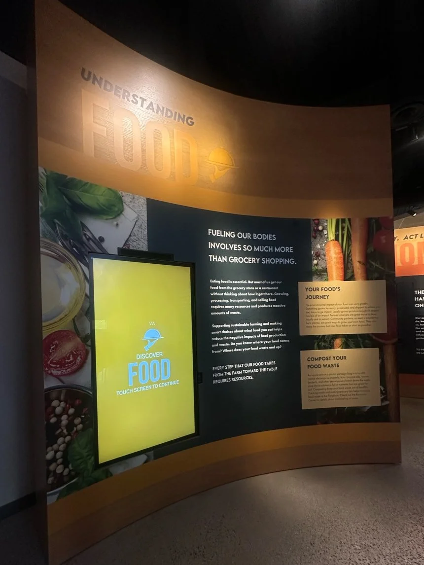
THE PROBLEM: A Boring Experience That Doesn’t Stick
The current Food Sustainability Exhibit at the Chicago Nature Museum is just a video on repeat. There’s no way to pause, explore, or interact with it. For visitors, especially for middle school students, it quickly becomes a boring and easy-to-tune-out experience.
We knew it needed more, something hands-on, fun, and educational.
OUR GOAL: Make It Stick
Our goal is to make the Food Sustainability Exhibit more engaging and interactive for visitors. We want it to feel hopeful, inspire visitors to take action locally, and easily connect them with resources like the Chicago Conservation Corps (C3). We're designing specifically for the existing screens, making sure content is easy to understand (around a 6th-grade reading level) and accessible to everyone.

Challenges I Faced
I had no prior experience with Unity, but chose to lead development because I wanted to push myself farther.
I had to learn Unity and build a fully functional interactive experience in just 7 weeks.
I worked with a team that had different perspectives and ideas, which sometimes made decision-making challenging.
One team member was working remotely abroad the entire time, which required extra coordination and communication.
We worked with a real client, where expectations shifted during the project, requiring us to adapt quickly.
We had a tight deadline, which meant using external code for certain features (like animations) to deliver on time.
What I Learned
How to teach myself a new tool (Unity) and lead the full development process under pressure.
How to communicate clearly and align a team with different working styles and viewpoints.
How to work with a real client and stay flexible when the project needs change.
How to lead a distributed team and manage collaboration across time zones.
How to design and build an interactive experience that successfully draws people in and keeps them engaged in a public space.
How to stay resilient and adaptable when facing technical challenges, shifting priorities, and tight deadlines.

Let’s Explore the Process Step by Step:
1
2
3
4
5
6
Let's Explore in Details
Let's Explore in Details
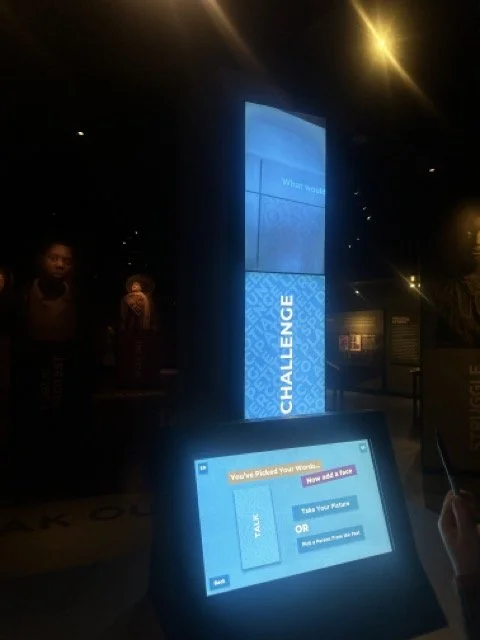
Competitive Analysis
We began our research by watching how visitors engaged with museum displays and digital systems at the Chicago History Museum. We observed what aspects of these displays encouraged and discouraged interaction. We have noticed:
Visitors often walked away if the interaction took too long (too much talking, waiting, etc.).
People really enjoyed exhibits that felt personal, like taking a photo or adding something themselves.
Simple and easy-to-use screens got more people to try the experience, including kids and older adults.

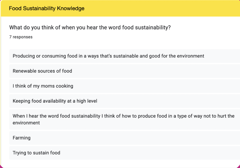
User Survey Questions
Designed to understand middle and high school students' perspectives on museums and food sustainability
19 questions
Multiple choice, open-ended, scale-based
Collecting qualitative and quantitative data
Demographics

Museum Experience

Food Sustainability Knowledge

User Research
We created a short survey to gather insights directly from our target audience, middle school students. Since our time to recruit participants was limited, we distributed the survey through local networks and shared it in community Facebook groups.
Target audience: Middle school visitors
Distribution: Local networks + community Facebook groups
Additional research: Conducted 1 informal user interview to gather extra perspectives
Screening questions: Included questions about age and school level to ensure responses were from the right audience
Research Findings


Affinity Map
After collecting all our notes from interviews and surveys, things felt a little all over the place. To make sense of it all, we created an affinity map. It helped us group similar thoughts, spot patterns, and see what really mattered to our users.
📌Red notes: pain points
🌱Green notes: positive responses
🟣Purple notes: time-related
🔷Blue notes: neutral responses

Main Takeaways
4 out of 7 students don’t participate in any food sustainability practices
3-5 minutes students spend on each exhibit
Most students are less aware about urban farming and composting
Students often find museum exhibits boring
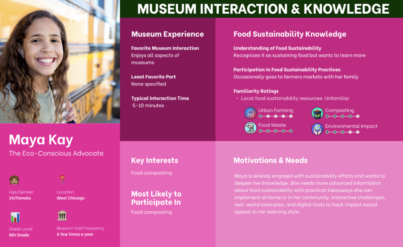
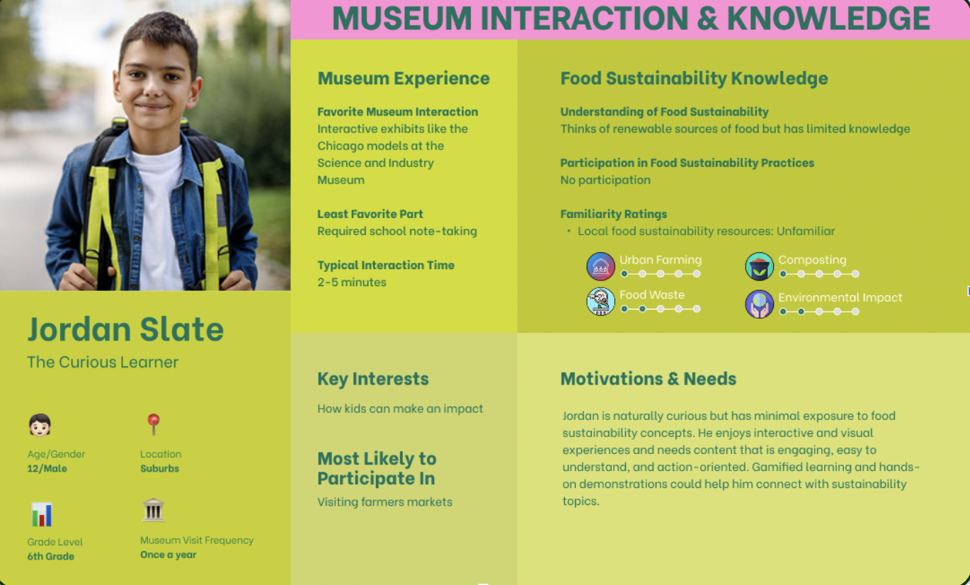
Personas
Empathy Map
This empathy map helps us understand how a middle schooler might experience the interactive food waste exhibit at the museum. By mapping their thoughts, feelings, and actions, we can design an exhibit that’s not just informative but also interactive, personal, and inspiring, encouraging real-world action on food waste.

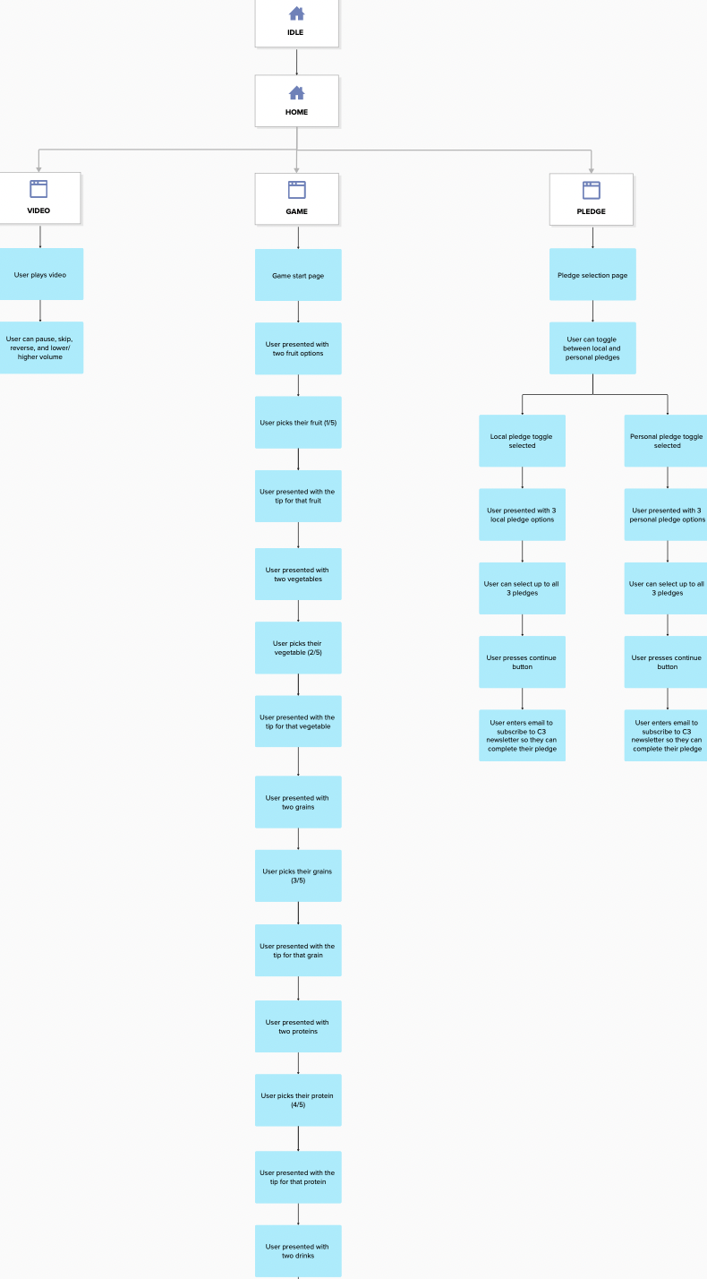
WireFraming and Prototyping
Step 1. Site Map
To make sure everyone’s ideas were included, we each sketched our concepts first, then came together to review and combine them. This helped us think creatively and align on a shared direction for the design.
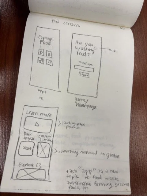
Step 2. Sketches
We each sketched our ideas first to make sure everyone’s voice was included, then came together to review and combine them. This sparked creative thinking and helped us align on a shared direction for the design.
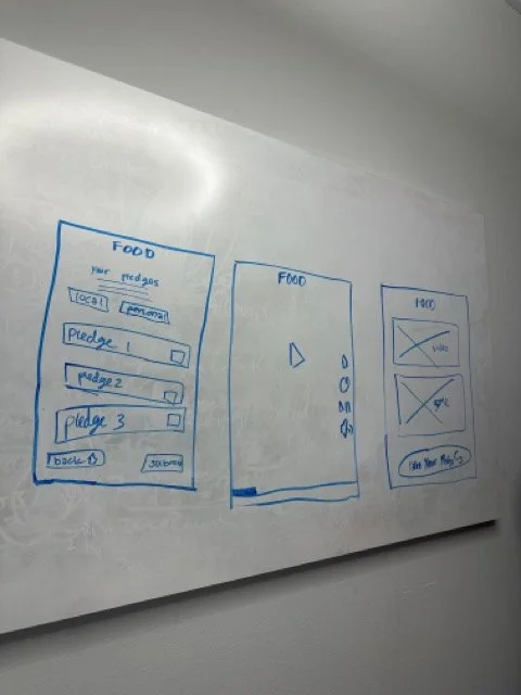
Step 3. Wireframes
After consolidating our ideas through sketches, we translated them into wireframes to define the layout, functionality, and hierarchy of each screen. This step helped us visualize the user flow more clearly and prepare for prototyping.


Step 4. Prototyping
Finally, after aligning on a direction with both our team and the museum staff, we developed a high-fidelity prototype that brought our ideas to life. The prototype reflected the agreed-upon structure, interactions, and visual design, allowing us to test the full experience and gather feedback before final implementation..
Development
I was responsible for being the Head of the Development team
This was my first time using Unity. I taught myself the tool and built the entire interactive experience in just 7 weeks. It was a huge learning curve, but I loved the challenge and pushed through it.

Challenges We Faced
Limited time for animations → we used outside code and assets to help us meet the deadline.
Technical bugs & version control issues → I spent many late nights troubleshooting and making sure everything worked smoothly.
Performance on museum screens → we had to optimize the experience for large touchscreens, which required lots of testing and adjustments.
How We Overcame Them
I stayed flexible and adapted solutions when time or resources were limited.
I led the team in identifying and fixing bugs quickly.
I kept the focus on delivering a polished, engaging user experience — even with technical and time limitations.
Testing & Iteration
Client Feedback
What We Did:
We met regularly with museum staff throughout development to review builds and gather feedback. Their input helped us fine-tune both the game’s content and overall experience. They also gave suggestions on making the game feel more relevant to the local audience.
What We Changed:
Expanded the game to include sustainability tips for each food choice, moving beyond a simple “this or that” selection.
Added a Review Tips screen to reinforce key takeaways and encourage real-world action.
Added Chicago-specific foods and tips to make the experience feel more local and relatable.
Added a fun animation where selected food slices land on the plate — a suggestion from the client that made the interaction more playful.

Play Testing (On-site Testing at Museum)
What We Did:
We ran multiple rounds of play testing on the actual museum exhibit screen to observe how visitors interacted with the game in a real environment. We wanted to ensure the experience was accessible and visually clear in a busy public space. We also tested how quickly and easily visitors could understand the game flow.
What We Changed:
Increased font weights (made text bolder) to improve readability from a distance.
Enlarged key elements (buttons, food items) to make them easier to see and tap on a large touchscreen.
Adjusted background color to improve contrast and overall visual clarity.
Usability Testing
What We Did:
We conducted 2 rounds of usability testing with 10 middle school students (ages 11–15), who represented our primary target audience. We tested early prototypes to see if the game was fun, easy to understand, and engaging. We focused on observing how they interacted with the game and gathering feedback on language, visuals, and navigation.
What We Changed:
Simplified the language to match a 6th-grade reading level, based on feedback that some text was too advanced or unclear.
Added more color and playful background details (clouds, barn, wood, decorative plate) to make the game feel more inviting and fun.
Replaced lengthy text tips with a QR code that allowed users to access sustainability tips on their mobile devices, after students showed a preference for this option.

& IDEAS BEHIND IT
FINAL DESIGN
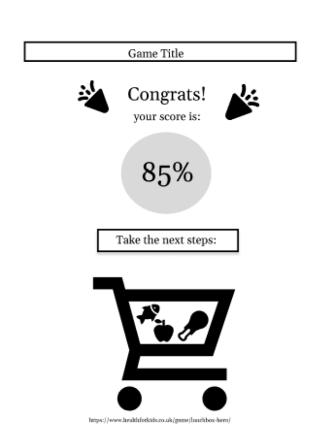
Our initial idea involved 2 sections:
A map screen where the visitor could filter locations in the Chicago area to find sustainable food hubs
A game where the visitor could choose from a number of food options and build their grocery cart.
These food items would be floating in groups and the visitor would only be able to pick a few items
They would receive facts about the sustainability of their food choices as they played
This would ultimately lead to a screen where their score was displayed

What: The map section was removed in its entirety.
Why: The game was more in line with the intended age group, and the design of the map was redundant when compared to websites and apps like The Greater Chicago Food Dispensary.
Intro Screen
What:
We designed a playful intro screen with colorful assets, wood textures, and food items ( all created by our asset team) to create a fun and welcoming feel.
Why:
We wanted to grab attention quickly and make sure visitors of all ages (especially kids and families) would feel comfortable and know exactly how to start. The goal was to make the game feel approachable and fun from the very first screen.
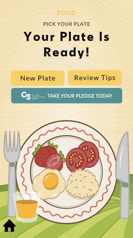
Final Screen
What :
The Final Plate screen shows visitors their completed plate. From this screen, visitors can choose to take a pledge, review sustainability tips (in case they missed them), replay the game, or return to the home screen. The layout was kept simple and easy to navigate, so visitors of all ages would feel confident moving through their next step.
Why:
To give visitors a moment to reflect on their food choices and see their full plate.
To encourage visitors to take real-world action through the Pledge option.
To offer a second chance to review sustainability tips.
To support replayability, encouraging visitors to explore new food combinations.
To provide a clear and simple navigation path so users feel in control of their next step.

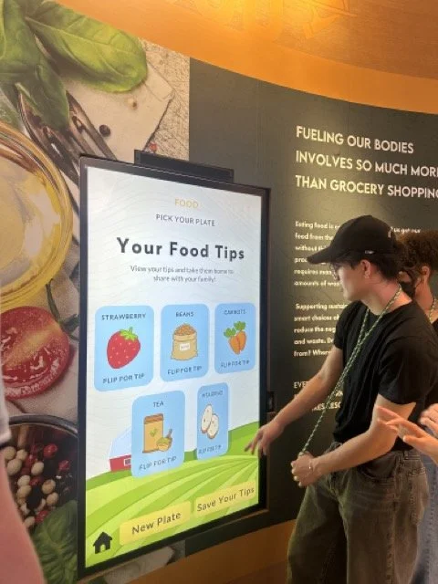
Pledge Cards
What:
The Review Pledge page allows visitors to revisit the sustainability tips connected to the food choices they made during the game. The page displays 5 cards, one for each food item the visitor selected. When a visitor clicks a card, it flips to reveal the corresponding sustainability tip. This lets visitors interact with the content at their own pace and reinforces key learning moments.
Why:
To give visitors an interactive way to review the sustainability tips connected to their food choices.
To reinforce learning by linking tips back to the specific foods they selected.
To make the review experience engaging and playful with a simple flip interaction.
To allow visitors to move through the tips at their own pace, supporting accessibility and different reading speeds.

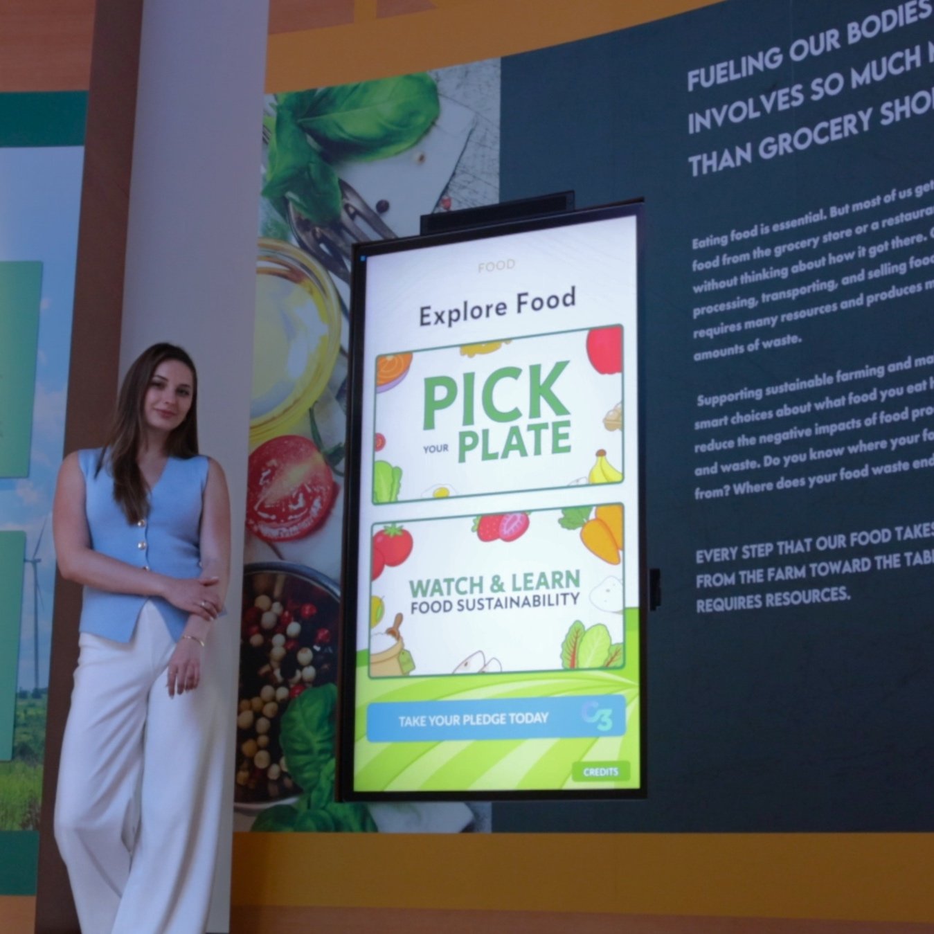
We designed a simple, playful game where visitors build their own plate by selecting different foods and learning sustainability tips along the way. The experience needed to be easy for all ages to understand, engaging enough to hold attention in a busy museum space, and flexible enough to support the museum’s mission.

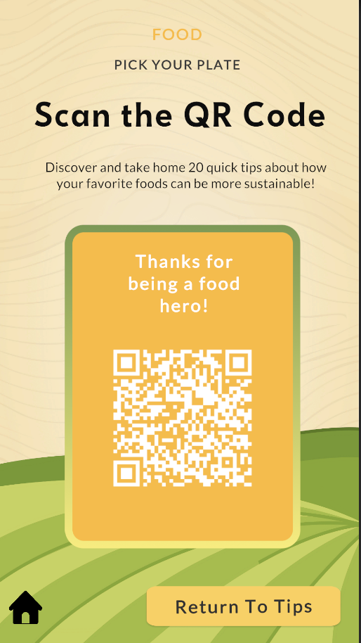
QR Code Screen
What:
At the end of the game, visitors have the option to save the sustainability tips for later. Initially, we planned to collect visitors’ emails and send the tips via email. However, after usability testing, we learned that most users didn’t want to enter their email, they felt it was too time-consuming .
Based on this feedback, we changed the flow to display a QR code that links to a PDF version of the tips. This allows visitors to simply scan the code with their phone and access the tips instantly , no typing required.
Why:
To make saving tips quick and effortless for visitors.
To respect visitor privacy, no need to collect email addresses.
To respond to usability feedback and remove unnecessary friction.
To offer an accessible solution that works for all device types.
To encourage more visitors to actually save and use the sustainability tips after their museum visit.
Final Game Experience

PDF Document:
What we did:
We designed a PDF document that includes all 20 sustainability tips for the foods featured in the game. This PDF is linked to the QR code and gives visitors a way to revisit all tips later on.
To make it feel connected to the game experience, we designed the PDF in a matching visual style, with a wooden background and farm elements. This creates a playful, consistent look that ties the digital handout back to the in-museum interaction.
Why we did it:
To give visitors easy access to all tips — not just the ones they saw in their game session.
To make the learning extend beyond the museum visit in a format they can keep.
To ensure the visual style stays consistent and playful, reinforcing the game’s theme.
To create a handout that is friendly and engaging — not just a plain text list.
To support the museum’s mission of helping visitors take sustainable actions at home.
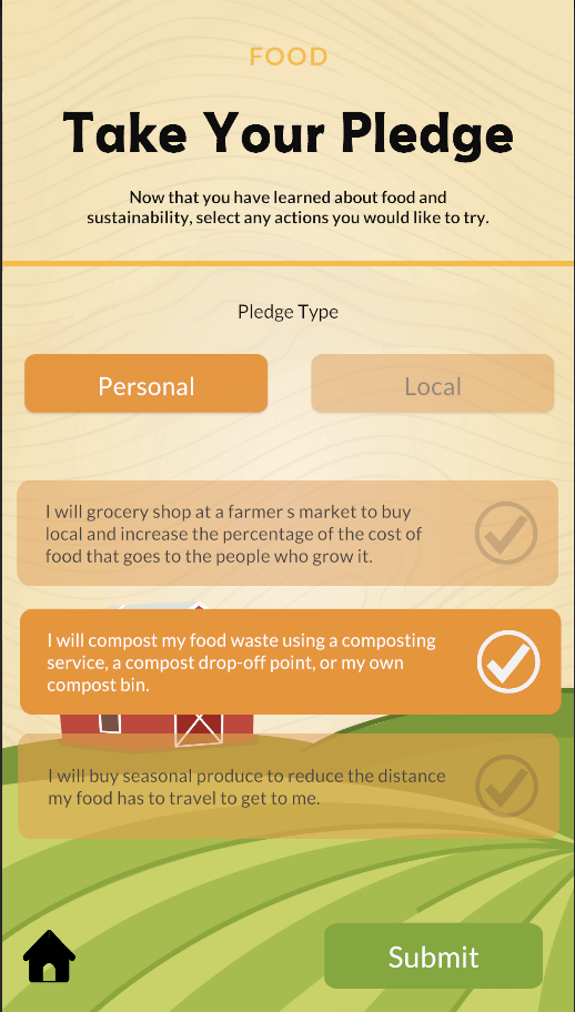
What:
We designed a simple and engaging Pledge experience to encourage visitors to take small sustainable actions. Visitors choose from 3 local pledges and 3 personal pledges, giving them flexibility to commit to actions that fit their lives.
After submitting their pledge, visitors see a Thank You pop-up featuring our Carrot Hero, to celebrate their action and keep the experience playful and positive.
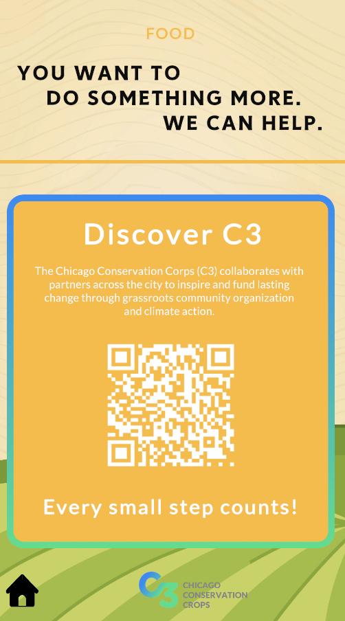
The screen then displays a QR code linking to the museum’s Chicago Conservation Corps (C3) project — an initiative that encourages visitors to take further action and connect with their local community.
Why:
To encourage visitors to take real-world action, starting with small, achievable steps.
To offer a choice between personal and local actions, making the pledge feel more relevant and flexible.
To create a positive feedback moment with the Carrot Hero, making the pledge feel fun and rewarding.
To connect visitors with C3 resources and help them take the next step toward community involvement.
To support the museum’s mission of inspiring ongoing, sustainable behavior beyond the exhibit.
Final Pledge Experience
Initial Design Ideas
What: The grocery store was reworked into a “this or that” plate system where visitors picked one item from a pair for each of the 5 main food groups.
Why: Once again, this is more in line with our intended age group. It also promotes healthy eating according to USDA guidelines
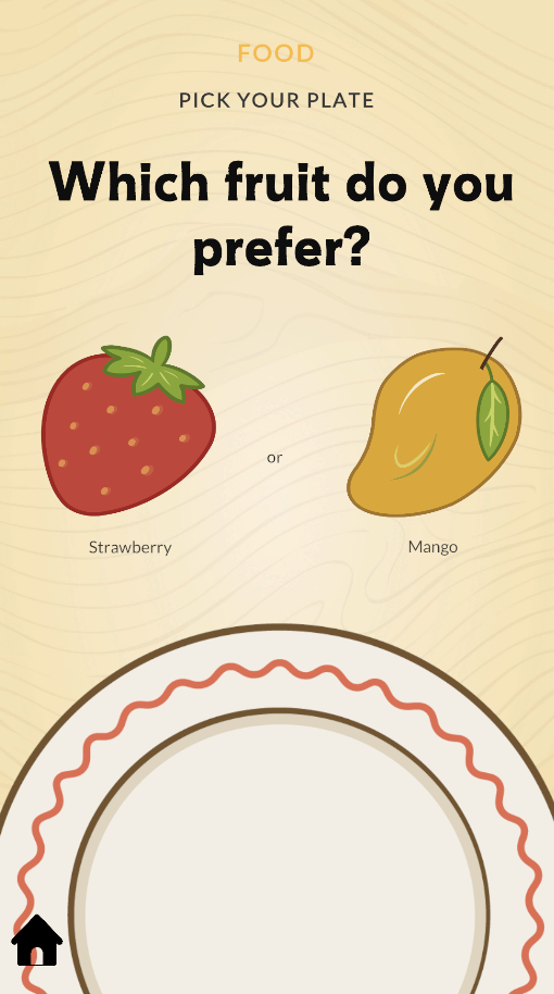
Game Idea
What:
We designed a simple and playful game where visitors build their own virtual plate by selecting items from 5 food categories (Fruits, Vegetables, Protein, Grains, Drink). Food options are randomized each time a visitor plays (in total 20 foods, 4 for each category)
When an item is selected, it falls onto the plate with a fun wiggle animation.
Why:
Building a plate gives visitors a sense of ownership and makes the experience more personal.
Randomization adds curiosity and replay value.
Animations make the interaction fun and rewarding, adding a playful tone to the learning experience.
The simple structure (5 choices → final plate) keeps the game fast and approachable.
We based the 5 food categories on the Healthy Plate methodology, a well-known global standard that promotes balanced, mindful eating.

What: The scoring system was removed in favor of emphasizing tips
Why: The current system is much better for spreading information and promoting action.
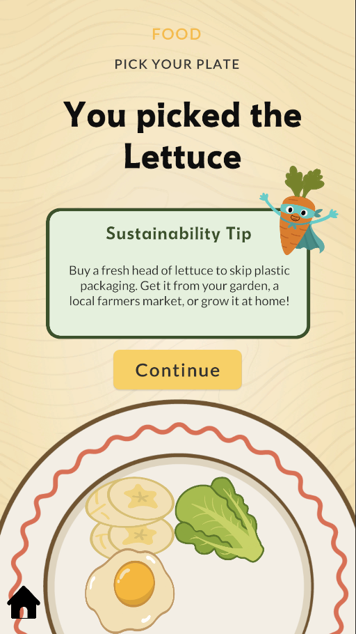
Tips Screen
What:
After each food choice, a short sustainability tip pops up. At first, we timed the tips to disappear automatically, but through testing, we added a Continue button so users could move at their own pace.
We also made the tips simpler and shorter after usability testing.They focus on how to shop more sustainably for each food category, with a local focus on Chicago. We added a playful Carrot Food Hero to make the tips more fun and memorable.
Why:
To make tips easy to read and understand for all ages.
To support accessibility by letting visitors control reading speed.
To connect sustainability advice to local, actionable choices.
To add personality and fun with the Carrot Food Hero, helping tips stick in visitors’ minds — especially for kids.
This project taught me so much! From leading development in Unity (a tool I had never used before) to working with a real client and adapting to their evolving feedback. I gained hands-on experience in UX research and testing, and saw how listening to users makes a real difference in the final product. I also learned how to balance design and development to create an experience that’s both fun and educational, and how to collaborate with a team across different time zones and work styles.
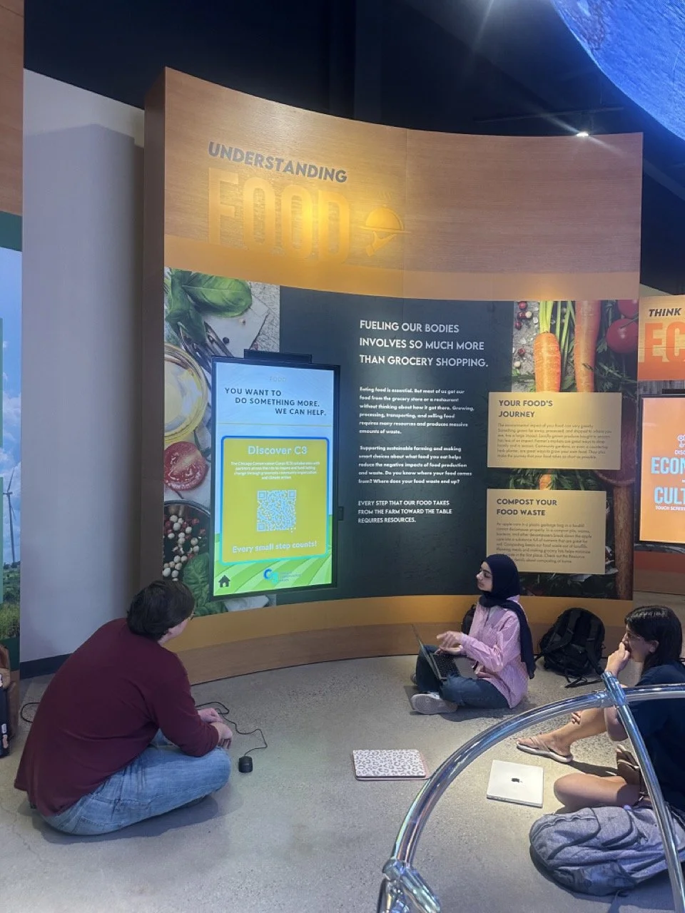
I’m incredibly thankful for this opportunity, and I hope you will get a chance to check it out live at the Chicago Nature Museum!